Week 5

Data Visualisation

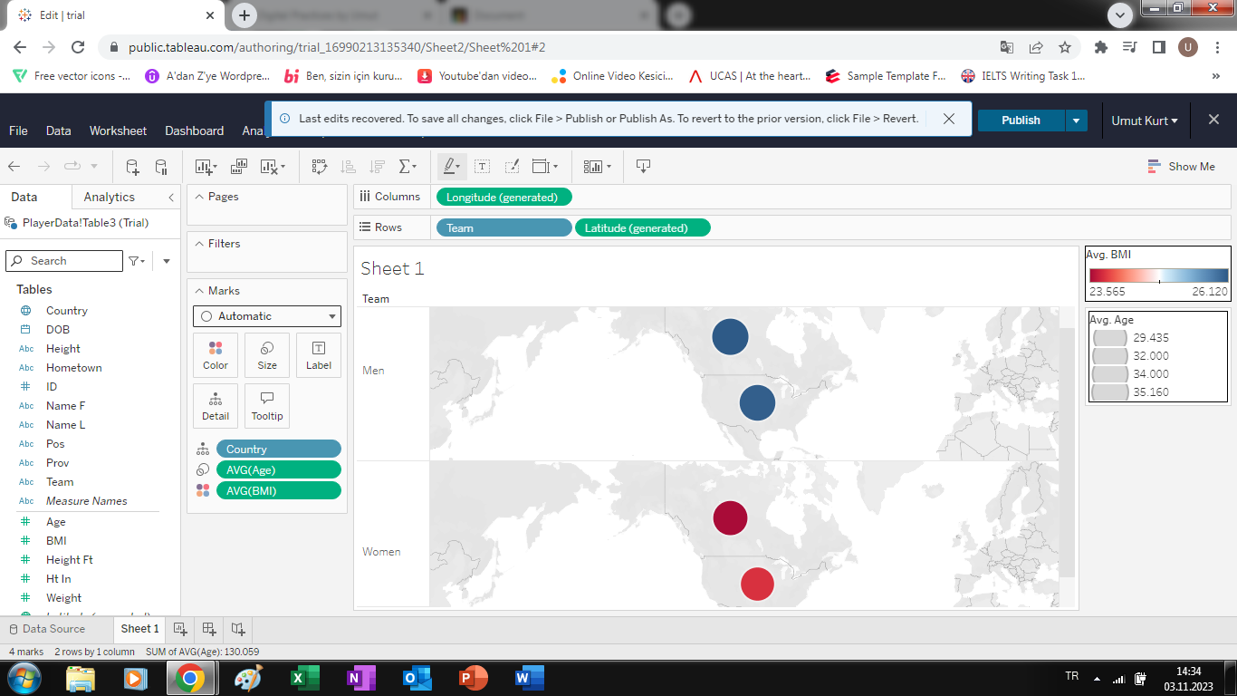
Data visualisation, through its graphical representation of information, significantly enhances the accessibility and insightfulness of data, making the identification of trends, outliers, and patterns notably easier. This invaluable tool in data analysis, whether in the form of charts, graphs, or interactive dashboards, not only empowers us to make informed decisions but also enables the effective communication of intricate findings in a manner that ensures the full realisation of data's potential.

Examples

Data Meets Art: My Tableau Public & Gephi Visualizations

Let's take a look at what I've been up to.

Tableau Public Gephi

I've recently conducted basic data visualization experiments using Tableau Public and Gephi with sample datasets. These trials have underscored the critical importance of data visualization in ensuring accurate data interpretation. Converting data into visual forms enhances insights, making complex information more accessible and ultimately improving data analysis precision.

Is there anything I can do for you?

I'm like a digital superhero without the cape.